
The SUQQU Summer 2017 collection launches May 25th in the UK. It was already out in Japan the beginning of May. I bought the two pieces I wanted from Japan. After not being able to grab the last few collections on Selfridges.com-due to selling out in hours or less in the middle of the night, I decided not to chance it and grabbed it from Japan. Details per SUQQU:
SUQQU’s summer makeup collection epitomises a tranquil summer vista, a quiet, relaxed day by the coast. It captures the shades of hot beach sand, cool blues of the ocean & glistening water, and the warm tones from the setting sun.

Two beautifully balanced quads for modern, chic summer looks. Each palette includes a deep shade in a cream formulation that easily defines the eyes or gives cool smoky effects.
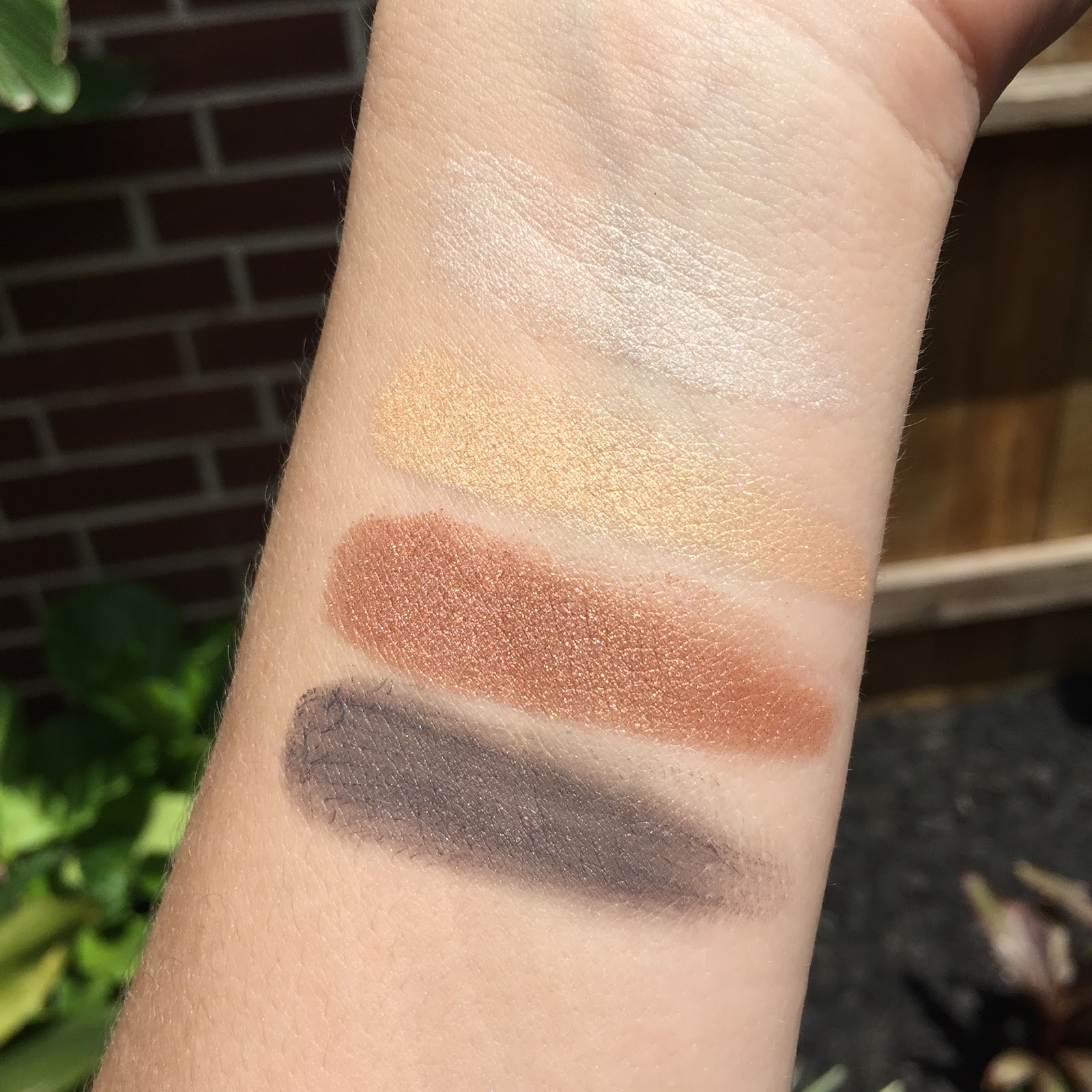
The Designing Color Eyes in 105 Hikarisuna is limited edition. It was the most suited to my preference for neutral eyes. It’s described as shiny bronze and warm grey. A warm, sophisticated grey in creamy formula combined with shimmery bronze.

The summer eye palettes come in a white case with gold trim versus the black of the permanent quads. Reminded me of Tom Ford’s summer collections which are always white and gold. Hikarisuna has a shimmering white, gold and copper powder. It also contains an elephant grey cream shade.
The white shade is slightly sheerer than the gold and copper. It has a very slight multi-tonal shimmer to it. It felt dry and powdery compared to SUQQU’s normal eyeshadow texture. The Designing Color Eyes palettes are actually a moister formula than their now discontinued Blend Color palettes. This was drier than both formulas. The gold is a basic shimmery medium yellow gold. No multi-tonal shimmer, just gold. The copper shade could be considered warm bronze or copper depending on your view of color. It was the best performing shade of the quad. It’s pigmented and smooth. The cream shade looks like a warm elephant grey in the pan, but once swatched it actually pulls cooler and almost has blue tones to it. It has a very very faint shimmer to it.
All three powder shades are drier in formula than the permanent Designing Color Eye quads recently released. It was a slight disappointment as I liked the new moist feel of the new quads. The white shimmer shade is the worst texture of the quad, it’s sheer powdery texture was just OK. The shades are very basic in this quad. Nothing ground breaking here. It’s warm in tone overall, very summery though. The cream shade is sheer but buildable. I used it on the lashline and built it up in the crease and outer 1/3 of the lid as my smoky base for the other shades. The cream shade didn’t crease on me, but I also didn’t use it on the whole lid, just on the outer lid and lashline. It does well layered under the powders. I can’t speak to it’s lasting power if used alone.
The copper looks nice over the grey. It plays with warm and cool, bronze and grey. These are the two best shades of the quad. The other two are just OK. I could do without them. I have mixed feelings about this quad. The colors are so basic and simple it’s easily dupeable. I don’t feel it’s necessary to own. It’s nice, but not spectacular like some SUQQU quads.

Swatches: Clockwise Starting Top Left:


The latest complexion palette from SUQQU gives a natural, flattering radiance while adding a healthy peachy tone to your face. Comes with a brush specially developed for this product, picks up and holds the powder well & allows an even application for a flawless finish.
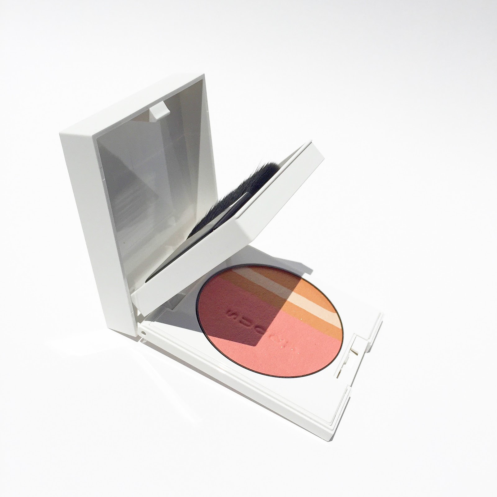
The SUQQU Cheek & Face Color palette comes in a white case and has a brush included.

This Face and Cheek palette has a peachy pink coral on the left. On the right is stripes of a light warm bronze and cream. The bronze has an orange undertone to it. The colors have a slight shimmer but nothing big nor noticeable on the cheeks.

The texture is not lightweight and silky like the Pure Color Blush. It’s thicker and a bit drier. It could be considered a bit powdery but it doesn’t look that way on the skin. The colors swirled together make a warm peachy coral pink most suitable for a blush. I have a light medium NC27 skin tone and this barely shows up on me. It adds a light peachy coral tint to the cheeks. It’s too dark to be a highlight or all over face powder, but it’s almost too light to be a blush for me. I tried the brush that came with the palette. It’s not a bad brush. It applies the powder lightly. I found I got better color payoff using my Chikuhodo Z-4 Brush. Oddly, it looks more pigmented swatched than Paul & Joe’s Spring Face & Eye Color in 107. However, on the face the Paul & Joe shows up better than the SUQQU.
I don’t feel that either piece is a necessary addition to any makeup collection. They’re OK, but a bit lackluster to more permanent SUQQU items like the Pure Color Blush and Designing Color Eyes.

Top to Bottom: L Side, R Side Mixed, All Sides Mixed:


Top to Bottom: L Side, R Side Mixed, All Sides Mixed, THREE Cheeky Chic Blush 08 Eternal Traveler, Paul & Joe Face & Eye Color 107 Mixed:

