The most recent things I’ve ordered to try from THREE is their new 4D-Plus Eye Palettes in #1 Close to Your Heart & 3 Transcend Time. Per THREE’s website: “This eye shadow palette, with four colors varying in hue, light and texture, enables a sophisticated blend and deep nuance. The key balancing factor is oil glue. The oil-based eye shadow glides onto the eyelids in a thin layer and smoothly lays one color over another, creating effortless, impressive shades. Capturing the light in any scene, these four characteristic hues transform into a sheer veil and deliver dimension and depth to the eye area. Effortless but expressive, your “smoldering eyes” will stand out.”
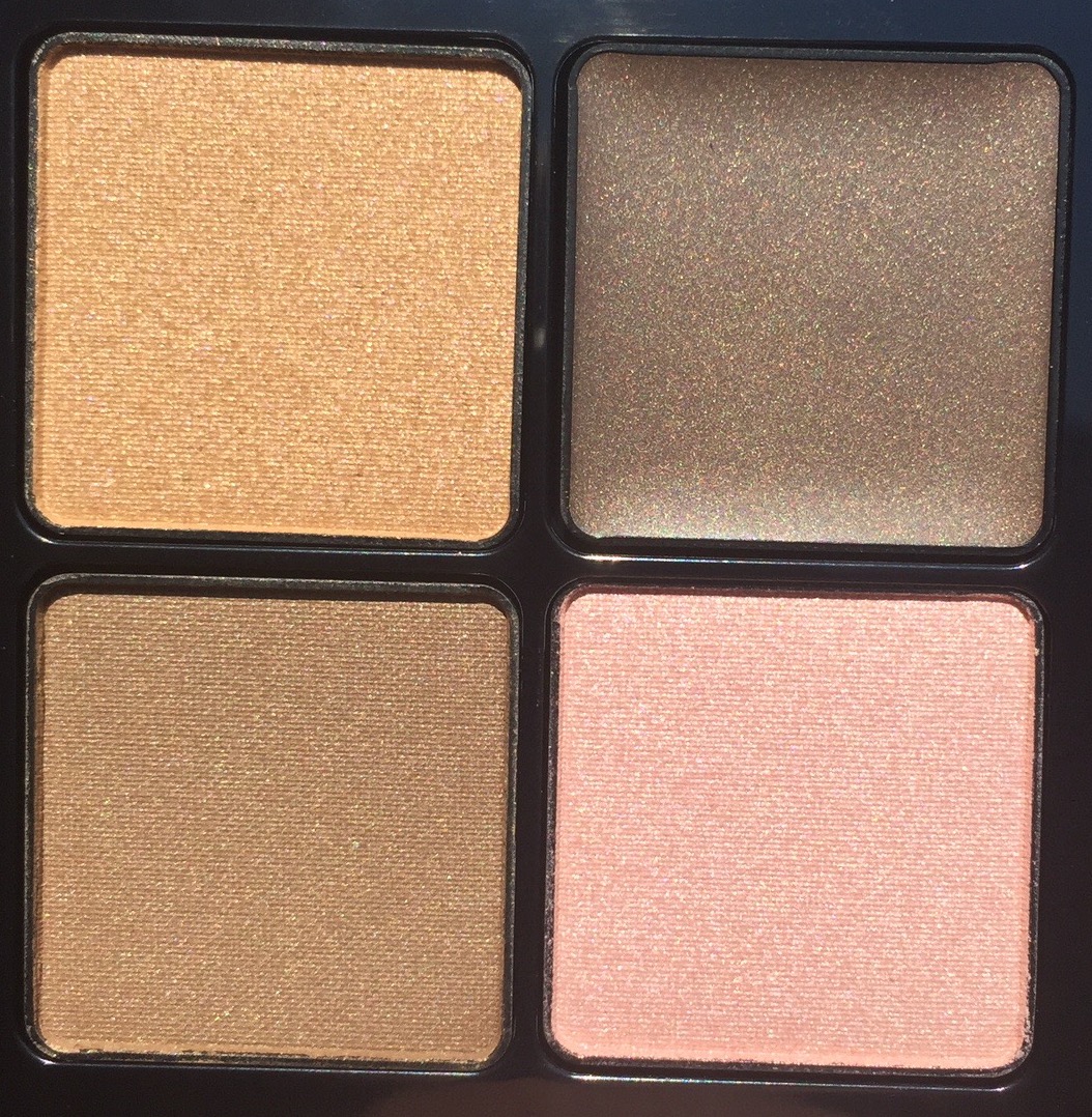
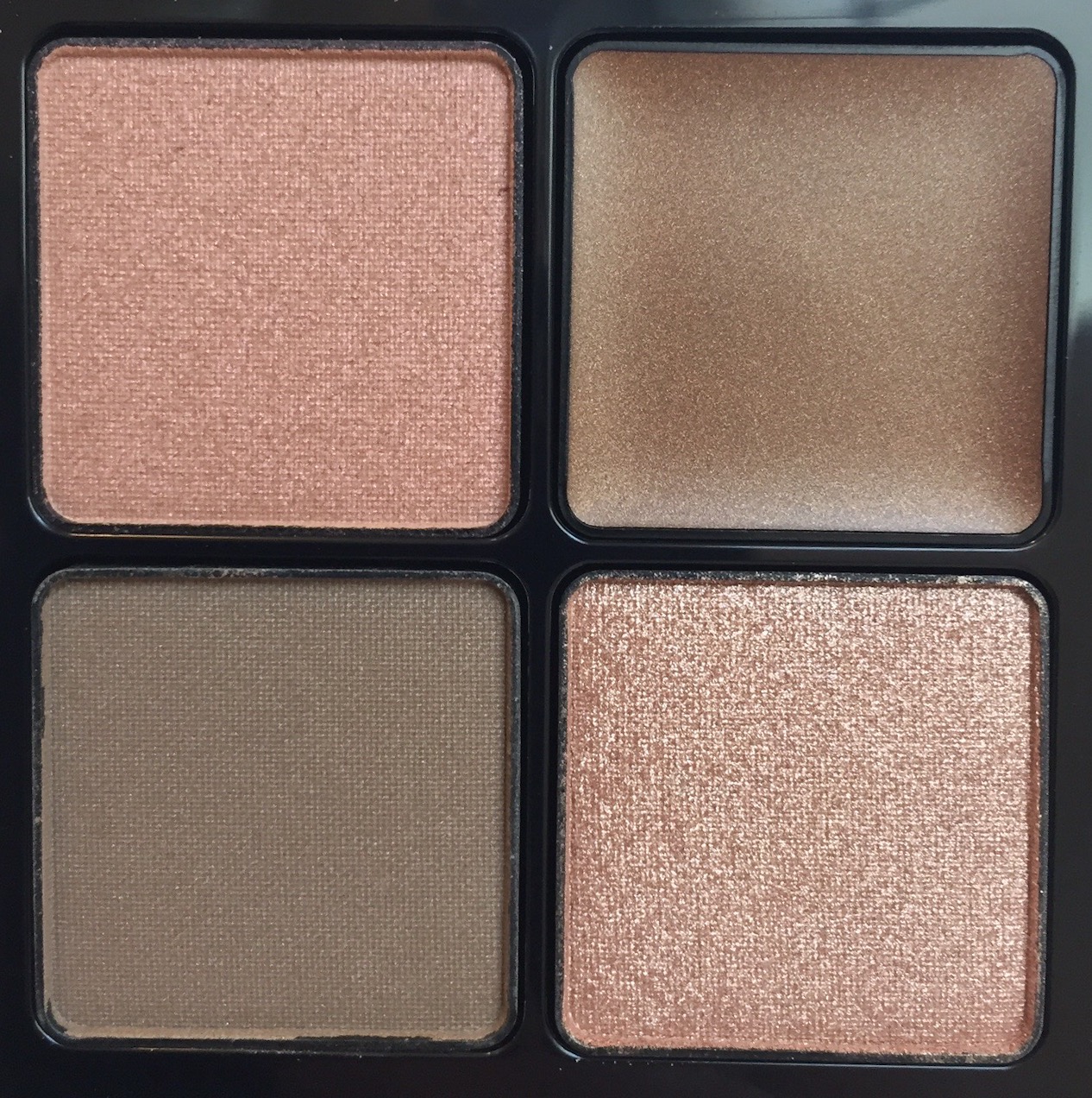
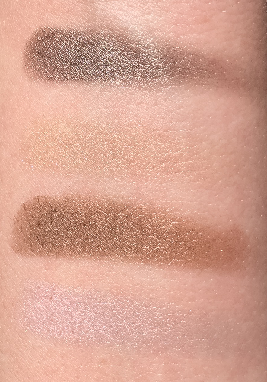
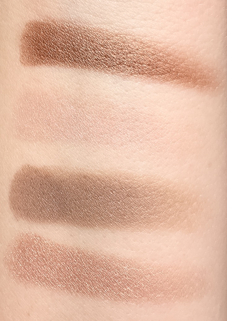
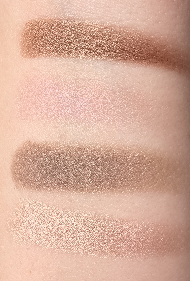
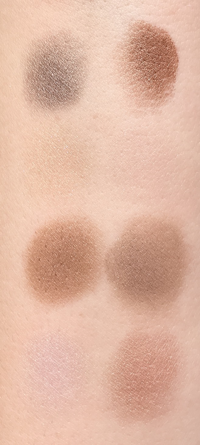
The top right shade in both palettes is the oil-glue base shade. The texture is a thinner cream shadow, it’s not sticky like glue or anything. It’s not overly oily, yet it’s not like a water based cream shadow either. This shade affects the overall tone of the palette the most. The top left shade in both palettes is a sheer micro glitter style accent shadow. The glitter is super fine, not overpowering and I didn’t notice any fall out from it. It reminds me of Tom Ford and Charlotte Tilbury’s glitter shades, except it’s much subtler glitter and not quite as dry. You want to use a stiffer brush to apply these as they are dry and hard to some degree. With a brush they apply great. They’re complex and it’s hard to capture how pretty they are in pictures. The bottom left shade is a shimmery satin in both palettes. The texture is thinner, maybe a touch dry, not powdery or buttery either. It applies evenly, smoothly and is light to medium pigmented. You need a brush to apply well, it swatches worse than it applies with a brush. The bottom right shades are a more pigmented metallic shimmery highlight shadow that are very smooth and even. These are the best texture of the palette.
I tended to apply the oil-glue shade over my lid, the satin in the crease, the metallic as a highlight or brow bone and the glitter over the oil-glue on the lid and crease. With each shade being a different texture you can definitely mix it up to create numerous looks. While the effect overall is still either a cool or warm brown eye, there is some cool effects added from the glitter and metallic shades. I didn’t find any creasing from the oil-glue cream shade. I used Urban Decay’s eye primer and then set it by adding a powder like the glitter shade over it. Both palettes are unique from shades I own and it is really hard to capture how pretty the metallic and glitter shades are in real life. While both palettes enhance a basic brown look, they won’t be for everyone. Especially if you don’t love nudes.
THREE suggests applying the oil-glue shade first in the outer third of the upper lid and on the bottom edge of the upper lid near the lash line. Then apply the medium(satin) shade on the whole lid. Next apply the glitter accent shade on the lid extending past the medium shade. Last apply the highlight shade on the inner “v” or tear duct area of your eye. I suppose applying this way will have the overall tone of the look most affected by the medium not oil-glue shade. I have yet to try it this way since I just found this information on their website last night.
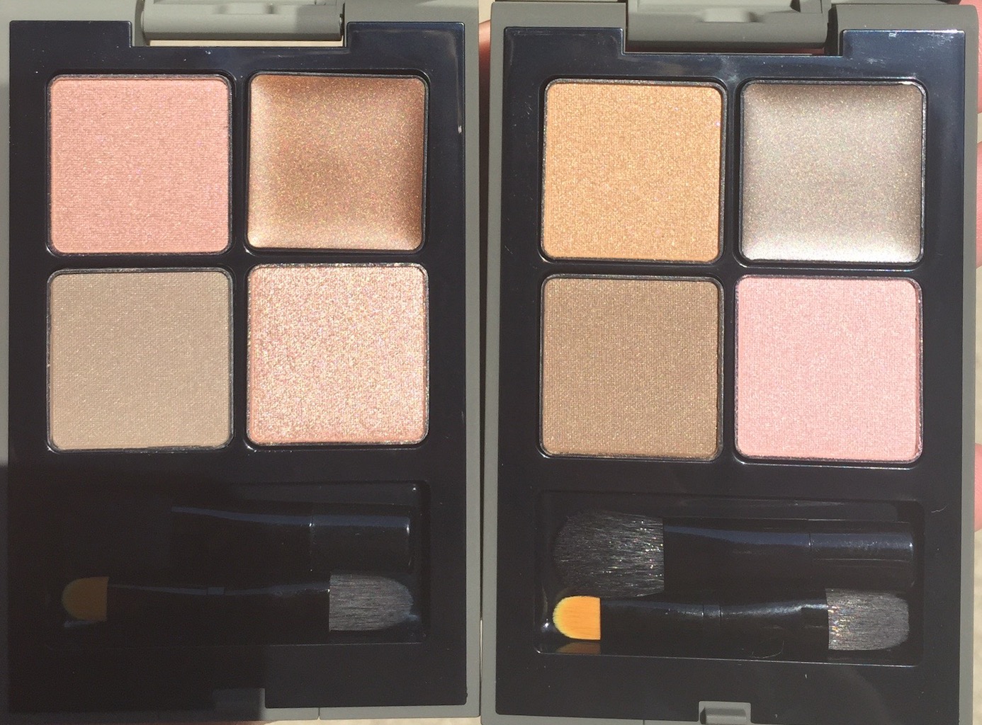
#1 Close to Your Heart is described as “This smoky brown palette with a gentle gold hue creates a pure impression.” The top left is a sheer glittery gold shade that has gold and purple glitter in it. The top right oil-glue is a shimmery, cool ashy brown. The bottom left is a shimmery, satin, neutral medium brown. The bottom right is a cool, metallic, light iridescent pink. Overall, this palette gives a cooler brown eye effect.
#3 Transcend Time is described as “This pink-brown palette with a chic, brilliant reddish hue offers sensual looks.” The top left is a sheer warm glittery pink with pink and purple glitter, it’s actually a bit iridescent and hard to capture it’s full effect in pictures. It’s also less glittery and more subtle than the gold glitter shade in the other palette. It almost comes off as a shimmery shade, but in sunlight you see the glitter. The top right oil-glue shade is a shimmery, warm medium brown. The bottom left is a shimmery, satin, cool ashy brown. The bottom right is a cooler, metallic rose gold pink. Overall, the effect is a warm brown look.
Sunlight:
Swatches #1, Starting Top R then counter clockwise:
Swatches #3, Starting top R then counter clockwise:
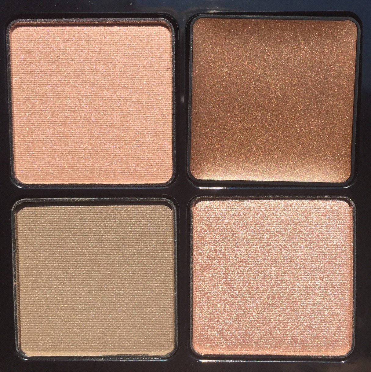
Compared side by side: L #3, R #1:
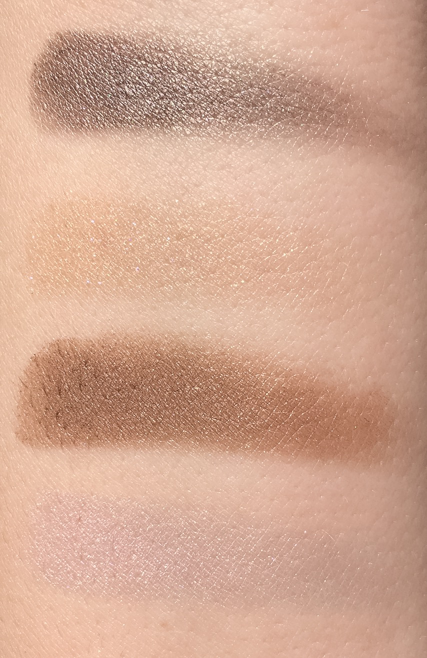
Sunlight: L #1, R #3:
L #1, R #3(This picture has a bit of a odd lighting to it, but it showed the iridescence the best) Starting top R then counter clockwise:
Sunlight: